#3.0 How to Add CSS to HTML
방법 1. HTML 파일 내부
<head> 안에 <style> 태그 사용

방법 2. HTML 파일과 분리 << better way* : seperate file means you can use this file in many all the html pages.
같은 경로 안에 .css 파일 생성
<head> 안에 <link> 태그 사용

#3.1 Writing Our First CSS Lines
step 1. point to an HTML tag : selector
step 2. { } (curly bracket, 중괄호)로 속성 묶어주기
step 3. write properties whatever you want
- 마지막에 ; 붙이기
- 속성이름에 띄어쓰기,언더바_, 슬래쉬/ ❌ only 하이픈- ⭕️
selector {
	property: value;
}
#3.2 What Does Cascading Mean
Cascading Style Sheet : they are read from top to the bottom
cascade : 작은 폭포, 계단식

What remains at the bottom is what you will see.
같은 속성에 대해 중복돼서 명령하여 충돌이 일어난다면 → 가장 마지막 코드 실행
The order will effect their result.
#3.3 Blocks and Inlines
does not allowed anything next to it. block
elements that allowed other elements next to them. inline == in the same line
Most boxes or all the boxes are blocks.
so inline 암기하는 게 더 쉬움 : <span>, <a>, <link>, <img />
#3.4 Margin Part One

Block(box)'s 3 property : margin , border, padding
Margin is a space from the border(경계, 테두리) of the box to the outside.
width와 height가 Block 요소는 있고 Inline 요소에는 없다.
브라우저는 요소들에게 원치 않아도 많은 style 속성을 준다.
user agent stylesheet : 브라우저가 기본적으로 준 style 속성
#3.5 Margin Part Two

CSS에서 방향 설정시 시계방향 순
*Collapsing margins
box의 border와 그 안의 box의 border가 겹친다면, 두 margin이 하나로 취급되는 현상
상하에서만 발생 👉 padding으로 해결 가능!
#3.6 Paddings and IDs
Padding is a space from the border of the box inside.
id has to be unique. one element can only have one id.
the name of id must be the same on the css as the name on the html.

#3.7 Border
* : everything

border는 inline과 block 모두에 적용된다.
#3.8 Classes
 |
 |
 |
span의 margin이 사면이 아닌 좌우에만 적용됨. 왜?
Because span is inline tag. inline do not have height or width.
인라인 태그의 margin을 상하로 적용하고 싶다면, 블럭 태그로 바꿀 것!


여러 태그에 중복해서 id를 부여하고 싶다면 → class 사용
또한, 한 태그에 여러 클래스 부여 가능.
CSS Diner
A fun game to help you learn and practice CSS selectors.
flukeout.github.io
#3.9 Inline Block
inline-block은
block처럼 높이와 너비를 가질 수 있음.
But, responsive design(반응형 디자인)을 지원하지 않음.
=> 비추천
#3.10 Flexbox Part One
rules of flex box
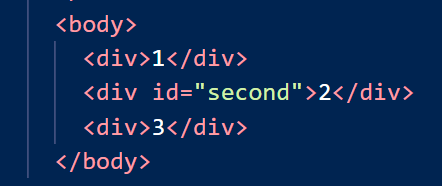
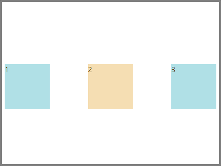
1. 자식 엘리먼트에는 어떤 것도 적지 말 것! 부모 엘리먼트에만 명시.
div에 변화를 주고 싶다면, div의 부모(body)를 display: flex로 만든다.


■
■ → ■■■
■
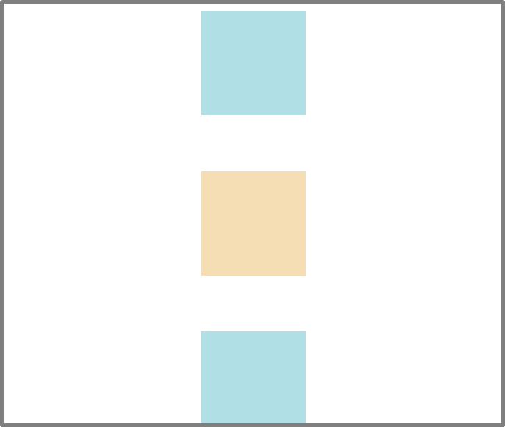
justify-content :
center → ___■■■__
flex-start → ■■■_____
flex-end → _____■■■
space-evenly → _■_■_■_ 빈 공간을 같은 크기로 나누어서 배치
space-around → _■□■□■_ (실제로 다른 경우의 언더바보다 공간 짧음)
space-between → ■__■__■
stretch → 늘어남
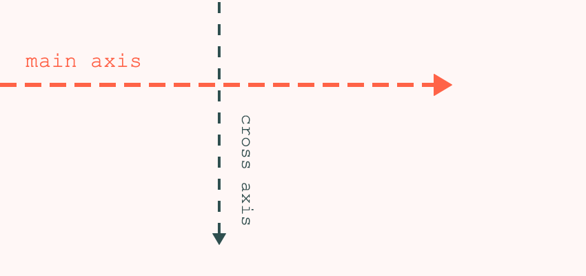
주축(main axis) - (default)수평 ← justify-content
교차축 (cross axis) - (default)수직 ← align-items
vh : viewport(=screen) height
ex. 100vh : 보이는 화면 높이의 100%
⑴ justify-content와 align-items를 적용하고 싶다면, 먼저 부모 엘리먼트에 display: flex;
⑵ 그러면 body가 flex container가 되고, flex container는 두 개의 축을 가짐. 주축&교차축
⑶ 디폴트로 주축은 수평이고 교차축은 수직
⑷ justify-content는 주축에 적용되고 align-items는 교차축에 적용
⑸ 만약 flex container가 height를 갖고 있지 않다면, align-items를 설정하여도 바뀌지 않는다.
why? 자식 엘리먼트의 높이로 body가 맨 위아래를 다 차지하기 때문.
so, flex-container에 height 추가
#3.11 Flexbox Part Two
main axis와 cross axis를 기본값과 다르게 사용하고 싶을 때,
flex-direction: row (default) | column | row-reverse | column-reverse

align-items: center;

align-items: flex-end;


flex-wrap:


flex-direction:


Flexbox Froggy
A game for learning CSS flexbox
flexboxfroggy.com
#3.12 Fixed
position - 위치를 아주 조금 옮기고 싶을 때 사용
기존 layer에 위치했던 곳에 고정되어있다가
top, left, right, bottom 중 하나만 수정해도 앞에 있는 레이어로 이동하여 기존 위치는 무시된다.
→ 스크롤해도 첫 위치 그대로 고정


Don't forget the moment you say position: fixed; , you will break our way from the layer.
Now it's on top of everything. Don't forget. It will be on top of everything.
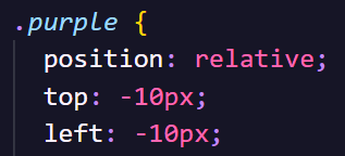
#3.13 Relative Absolute

position: relative;
starting position - 엘리먼트가 처음 위치한 곳을 기준으로 상하좌우 움직임.
The element begins where it should be,
and then you modified based on when it started.

position: absolute;
starting position - 가장 가까운 relative 부모
position: absolute will align itself according to the closest relative father.
Father of .purple is this div and this div is not relative. It's absolute.
<body> is the relative one.
So .purple div is absolute and .purple is looking forward to relative father.

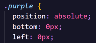

만약 body를 기준으로 하고 싶지 않다면,
감싸고 있는 부모 div를 relative로 만들어준다.
div { position : relative; }
position : static(default) / fixed / absolute / relative
#3.14 Pseudo Selectors part One
psudo selctor >>> class or id
<style>
<element>:
first-child {}
last-child {}
nth-child(index+1) {}
nth-child(even / odd) {} == nth-child(2n / 2n+1) {}
3n, 4n+1 ...
</style>
#3.15 Combinators
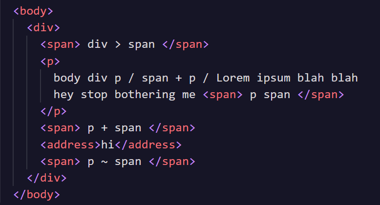
<style>
<부모> <자식> {}
ex. p span - p를 부모로 하는 span
<부모> > <자식> {}
ex. div > span - 부모 div 바로 밑에 있는 자식 span ( > 없으면 span 두개 다 해당)
<형제> + <형제> {}
ex. p + span - p와 형제 관계이면서 바로 뒤에 나오는 span
</style>
만약 존재하지 않은 구조를 쓴다면, 블럭 안의 내용 적용되지 않음.
#3.16 Pseudo Selectors part Two
<style>
<형제> ~ <형제> {}
ex. p ~ span - p와 형제 관계이면서 바로 뒤에 오지 않는 span
<element>
: optional {}
: required {}
[type="password"] {}
[placeholder="First name"] {}
[placeholder~="name"] {} - placeholder에 name이 포함 되는 경우(~ 포함 / $ 끝 / ^ 처음)
nth-child(even / odd) {} == nth-child(2n / 2n+1) {}
3n, 4n+1 ...
</style>

더 많은 css attribute selctors 보러가기
developer.mozilla.org/en-US/docs/Web/CSS/Attribute_selectors
#3.17 States
개발자 도구에서 확인할 수 있는 가장 중요한 selector는 state
- active

- hover

- focus

- visited


응용 form:hover input:focus - 커서가 form 위로 올라가고 & input이 focused 상태이면
#3.18 Recap
Pseudo-Elements
<style>
<element>::placeholder
::selection - 마우스 커서로 선택하는 글자들
::first-letter - 문장의 첫 글자
::first-line - 문장의 첫 줄
</style>
developer.mozilla.org/en-US/docs/Web/CSS/::placeholder
::placeholder
The ::placeholder CSS pseudo-element represents the placeholder text in an input or textarea element.
developer.mozilla.org
#3.19 Colors and Variables
CSS' Color System
1. hexadecimal color(16진수 색깔)
ex) color code #fcce00
2. RGB
ex) red,green,blue rgb(252, 206, 0)
3. RGBA
ex) rgb,alpha(transparency) rgba(252, 206, 0, 0.5) - 50% opacity
0 투명도 100% ~ 1 불투명 100%
* 이름이 정해지지 않은 색깔을 중복하여 적용할 때, 변경할 경우, 적용된 모든 코드를 수정해야하는 번거로움 발생.

'Front-end > 코코아톡 클론 코딩' 카테고리의 다른 글
| #5 Git and Github (0) | 2024.04.22 |
|---|---|
| #6 Cloning Time (0) | 2021.03.10 |
| #0 INTRODUCTION (0) | 2021.03.02 |
| #4 CSS ⅱ (0) | 2020.11.18 |
| #2 HTML (0) | 2020.08.21 |